How well is your Club
doing? Are you beating the market? Are you making money? Would
you have made more money by putting your subscriptions into an index tracker
rather than into your Club? What is the return from your
investments? Would you have made more money just by leaving it in the
bank.....or even just putting it under your mattress?
These are all questions that
every Club member should have an interest in. But answering them is not as
simple as you might think. The Rolling Stocks Investment Club has grappled
with these questions and use a number of measurements to help us see the
answers. This page provides a number of graphs and statistics that help
illustrate the performance of our Club. It acts as a "metrics
catalogue" as no single measure is sufficient. Indeed, using any
single measure can be very misleading if you rely on it as the definitive
assessment of your Club's performance.
The table below lists the metrics we use with a
quick description of why each
is useful and provides a link to more detail about how the metric is calculated,
the current graph for it, and the possible dangers of misinterpretation if you
were to use that metric in isolation as a measure of your club's performance.
| Metric |
Why The Metric Is Useful |
| 1 |
Asset Value |
Shows how much money the
Club is worth. |
| 2 |
Profit |
Shows whether
the Club is worth more than has been put into it. |
| 3 |
Return on Investment
(ROI) |
Shows the Club's profit
as a percentage of all the funds that have been invested in the Club. |
| 4 |
Unit Value (UV) |
Is the primary accounting
tool used for tracking each member's holding in the Club but also shows
how good your collective investment choices have been. It is a
"time-weighted" metric. |
| 5 |
Annualised Rate Of Return
(ARR) |
Shows the Club's return
on investment but takes account of how long that money has been
invested. In effect, the ARR is the equivalent rate of interest that
would have to have been paid at a bank on all your subscriptions in order
to grow that money to the Club's Asset Value . It is a
"money-weighted" metric. |
1: ASSET VALUE
This graph plots the net asset value of the club (i.e. how much we're
worth) in pink. It is calculated as being the sum of the net realisable
value of each investment plus any cash (i.e. what the Club would have as assets
if we sold all our holdings and wound the Club up). It is compared against how much money we have put in (in
green) and what would have happened to our subscriptions if we had
invested them in a FTSE Allshare tracker (in blue) rather than putting them into our
club.
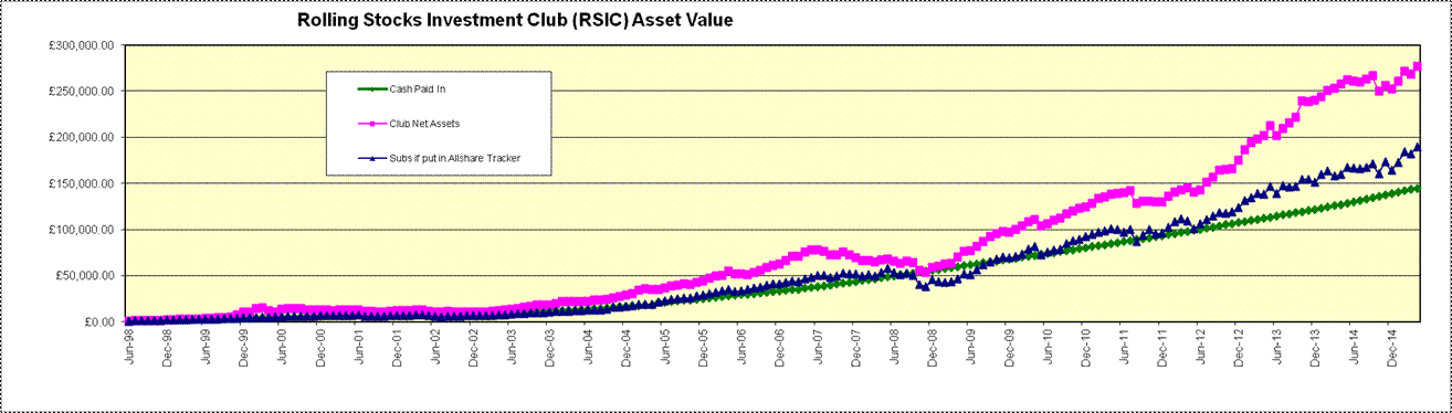
Danger of misinterpreting the net asset metric.
If Club A is worth È20k
and Club B is worth È10k then is Club A twice as good as Club B?
Not necessarily as it tells you nothing about profits. Using asset value alone doesn't
tell you how the Club
has performed. It needs to be combined with the metric below.
(back to the top)
2: PROFIT
This graph plots the club's profit
over time in pink. It is calculated as simply being the difference between
the net asset value (see metric 1 above) and the sum of all the
subscriptions. It is, in effect, the distance between the pink and green
lines in the above graph. It is compared against what the profits would have
been had we invested our subscriptions into a FTSE Allshare tracker rather than putting them into our
club. This line, in blue, is effectively the distance between the
green line and the blue line in the above graph.
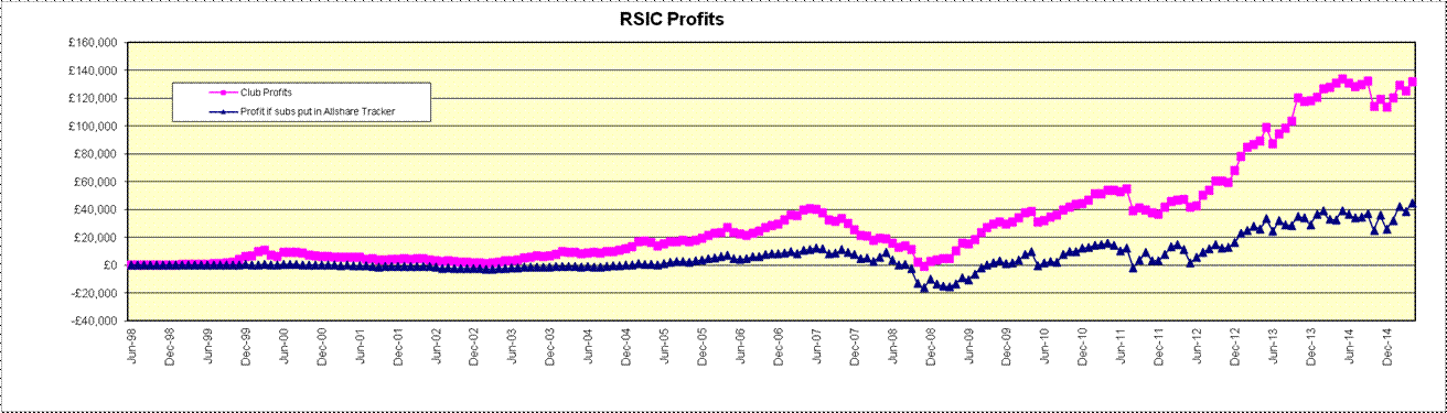
Danger of misinterpreting the profit metric.
If Club C has made È10k
profit and Club D has made È5k profit then is Club C twice as good as
Club D? Not necessarily, as it depends how much has been invested in
each club. For example, if Club C had made its È10k profit on
È100k subs, whereas Club D had made its È5k profit on È10k subs then
whilst Club C has made most profit, Club D has done relatively better with
its investment.
(back to the top)
3. RETURN ON
INVESTMENT (ROI)
This graph plots the Club's
return on investment over time (in pink). It is calculated as the profit (see metric
2 above) divided by the sum
of all the subscriptions paid into the Club, expressed as a percentage
(e.g. if a club has made È5k profit on È10k subs then it has made a 50%
ROI). It is compared against what the return on investment would have been had
invested our subscriptions into a FTSE Allshare tracker (in blue) rather than putting them into our
club
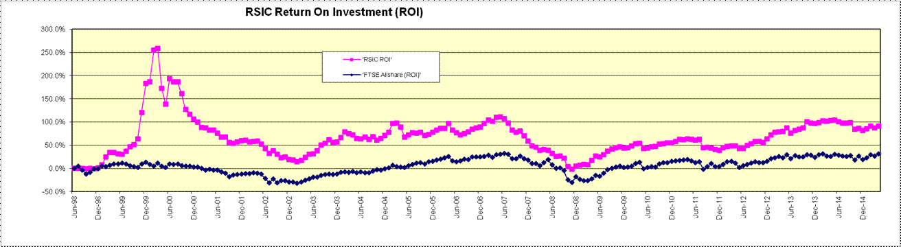
Danger of misinterpreting the ROI metric.
If, as in the example in metric 2, Club C has a ROI of 10% (10k/100k) and Club D has a ROI of
50%(5k/10k) then is Club D five times better than Club C? Not
necessarily, as it depends how long the return as been over. There
are two aspects to this. Firstly, Club D may have put its È10k
investment together 10 years ago and obtained the È5k profit over that
period whereas Club C may have only started investing yesterday and
they've already made a return of 10% on their È100k. Secondly, Club
C and D may even have possibly invested the same È10k amount at the same time
(with Club C making È10k profit on it and Club D È5k profit on it), but
if Club C then invests another È90k to their Club this will immediately
bring down their ROI, which is a little unfair!. Thus, even using ROI alone is misleading.
(back to the top)
4. UNIT VALUE
The first of the three graphs below simply plots the Club's
unit value over time. For an explanation of how unit value works and how
it is calculated, click
here. It is compared against the FTSE Allshare (in blue)
which has been rebased to allow a direct comparison. "Rebased"
simply means that its value has been adjusted to give it the same starting point
as the unit value when the Club started. For example, at the start of the
Club, the FTSE Allshare was at 2727. Dividing by 27.27 converts this number to
100. By dividing the value of the FTSE Allshare each month by 27.27, we
can plot it as a direct comparison against our unit value. The second
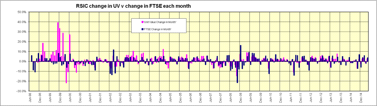
graph just shows the % change of our unit value each month and compares that
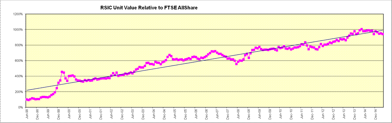
with the monthly % change of the FTSE Allshare. The third is an attempt to
show how the club has performed independently of the market as a whole. It
comprises the unit value divided by the rebased value of the FTSE AllShare. The
blue line is the linear regression trend (i.e. a 'best fit' straight line for
the data). The trend line slopes upwards which shows that the club has been
outperforming the market. The steepness of the slope represents the degree of
outperformance - the steeper the better. NB: If it were flat then the club
would be performing in line with the market and if it were sloping downwards
then it would be underperforming. This chart also shows the volatility of the
outperformance: if the pink line stays close to the trend line then the
outperformance is consistent; if it diverges significantly from it then the club
is performing rather better or worse than on average.
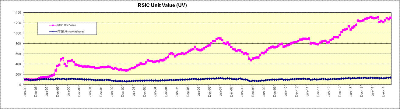
Danger of misinterpreting the Unit Value metric.
The Unit Value is probably one of the most used metrics but is also one of the
most misleading. For an illustration as to how misleading relying on unit
value can be as a measure of club performance, click
here.
(back to the top)
5. ANNUALISED RATE OF
RETURN (ARR)
The Annualised Rate Of Return (ARR) is, in practical
terms, the equivalent amount that a bank or building society would have had to
pay in interest to produce the same result as the club. It is sometimes
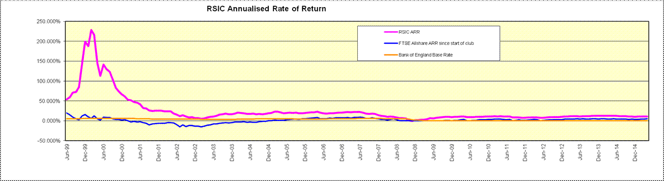
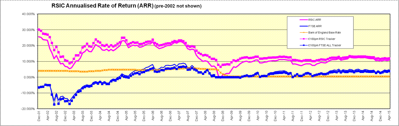
called the Internal Rate of Return (IRR). The graph below plots the ARR for the Club
since it started (in pink). This can be compared against the equivalent
ARR for the FTSE Allshare since the club started (in blue). Tthe
graph shows what the 12-month performance has been in ARR terms (in
orange). That is, whereas the pink line shows the average annualised rate
of return since the club began, the orange line shows the rate of return over
just each 12 month period. This can be compared against the Bank of
England base rate. The ARR is more difficult to calculate than
any of our other metrics but for an explanation of it works, click
here. It is compared against the annualised rate of return of a FTSE
Allshare tracker. The graph below is actually two graphs! This is
because the performance over the first couple of years when the club's assets
were small has such a significant impact on the y-axis that the graph isn't
sensitive enough to clearly distinguish between the lines in more recent
months. The second graph plots the same values but the plots prior to 2008
are not shown.
Danger of misinterpreting the ARR metric.
It's difficult to think of how the ARR metric can be misinterpreted.
Indeed, we don't think that there is a particular pitfall in using this metric
as a club with an ARR of 10% will always have performed better than a club with
an ARR of 5%. For these reasons, we believe that ARR is the most
appropriate measure of club performance. Just be aware that calculating the ARR
over a very small period can be misleading (for example, a rise of 10% in one
month is an ARR of 214%). For these reason, it is best to only start
quoting and comparing ARRs where the sample period is at least 12 months.
(back to the top)
The
Danger Of Relying On Unit Value .
Imagine that two clubs start up at the
same time, Club A and Club B say. Each has an initial È1000 and each club
has agreed an initial unit value of 100p. So.....each club has 1000
units. Easy.
Club A invests its È1000 in some shares and the shares
in treble overnight! "Fabbo" they say, understandably.
Club B invests its È1000 in some shares and they drop to a
third of their value overnight! "Not so fabbo" they say,
understandibly.
At this point, Club A's assets have grown from È1000 to È3000 and their unit
value will now be at 300p (as they've still got 1000 units).
At this point also, Club B's assets have shrunk from È1000 to È333 and their
unit value will now be 33.3p (as they've still got 1000 units too).
"Unit value still looks a good way of
comparing these two clubs though" you say. Yes but.......
Now let's say a few months pass and share prices haven't
moved at all (so no change in unit value for each club) and over that time each
club have put another È9000 cash in via their subscriptions. With
Club A's unit value still at 300p, this new cash will have 'purchased'
another 3000 units (È9000/300p) so they'll now have 4000 units.
Club A's assets
will have gone up to È12000 (the initial È1000 which had trebled to È3000,
and the new È9000 cash). Club B situation will be that their unit
value will still be at 33.3p so their new cash will have 'purchased' 27027 units
(È9000/33.3p) so they'll now have 28027 units. Club B's assets will have
gone up to È9333 (the initial È1000 which had dropped to a third in value
(È333) and the new È9000 cash). {Is
anyone still reading this stuff?.....I'll carry on just in case!}.
Now let's say both clubs
invest this new È9000 cash pile into shares so that both clubs are fully
invested.
Next day, all Club A's shares halve in value
overnight so their assets are down from È12000 to È6000. They still have
4000 units but now each is worth 150p instead of the 300p the previous night.
That same day, all Club B's shares have doubled overnight so their assets are up
from È9333 to È18666. They still have 28027 units but now each is worth 66.6p
instead of the 33.3p they were the previous night.
Club A has a unit value of 150p. Club
B has a unit value of 66.6p. Club A is more than twice as good
a Club B???
Club A has invested È10000 (the original È1000
plus the new È9000 subscriptions) and is now worth È6000 (i.e. a loss of
È4000)
Club B has invested È10000 (the original È1000 plus the new È9000
subscriptions) and is now worth È18666 (i.e. a profit of È8666).
"Using unit price as an
indicator of a club's success is pretty deceptive" you say.
Indeed.
(Note that the above illustration isn't
saying that your club should not use unit value at all. Our club relies on
the unit value approach to keep track of each member's holdings within the
club. This is what the unit value approach is for. It is an
excellent tool for managing how club funds are split between members. All
the illustration above is showing is that when a unit value is used to compare
two club, it is misleading as that is not what the unit value tool is
for). A more appropriate metric for measuring the performance of a club is
the Annualised Rate of Return (i.e. what interest rate would you have had to get
at a bank in order to turn all the subs you have paid into your club, into your
current asset value)).
(back to the top)